Overview
My roles
UI-UX designer, visual designer, mobile app tester, webflow no-code developer.
About LoopTas
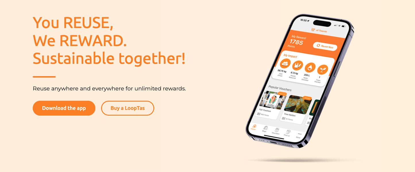
LoopTas is a sustainability startup in the Netherlands addressing the issue of forgotten grocery bags. While the government’s approach of charging for bags often just boosted store profits, people still forgot and bought new ones. LoopTas took a different approach by rewarding users who reused their NFC-chipped bags. Looptas allows users to scan the bag with their phone to prove reuse and earn rewards like discounts or donations. The bags also have a deposit and can be returned for a refund, helping reduce unused bags in homes. As someone who often forgot bags, I saw the value in this concept and partnered with the founder to improve the UX, making sustainable habits easier to adopt.
Identifying the problem
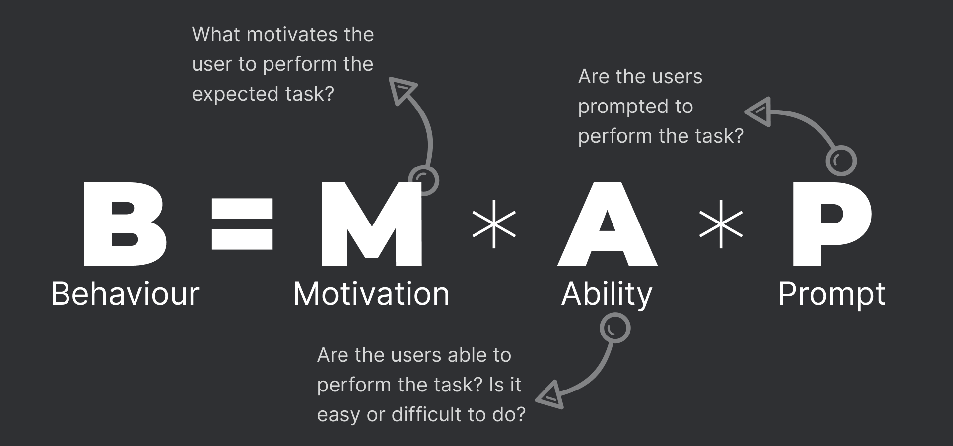
The concept was simple, and so was the technology. All users needed was a LoopTas bag available at the partner stores directly and to download an app. They reuse the bag to earn points. So why was it not driving change, why were users still buying more bags and forgetting to reuse. To understand this, we need understand how humans form habbits and how we can influence human behavior. I considered the 3 key ingredients for behavior change: Why users should act (motivation), how easy it is to act (ability), and when to prompt them (timing). This helped guide both the interaction flow and the reinforcement mechanism.
Understanding the product and identifying the challenge
Motivation: This depends on the reward users get in return. For LoopTas, users earn points to redeem rewards. Key questions: Are the rewards valuable enough? Do they justify the effort?
Ability: If users have the bag and the app, they can complete the action. Challenges may arise for less tech-savvy users or those with phones lacking NFC. Effort also affects ability—if the task feels too difficult or not worth the reward, users may skip it. Key questions: What stops users from downloading the app? Do they face issues reusing the bag?
Prompt: Are users prompted to use the bag? The challenge here is predicting when users leave for the store—it's difficult to prompt them before they go.
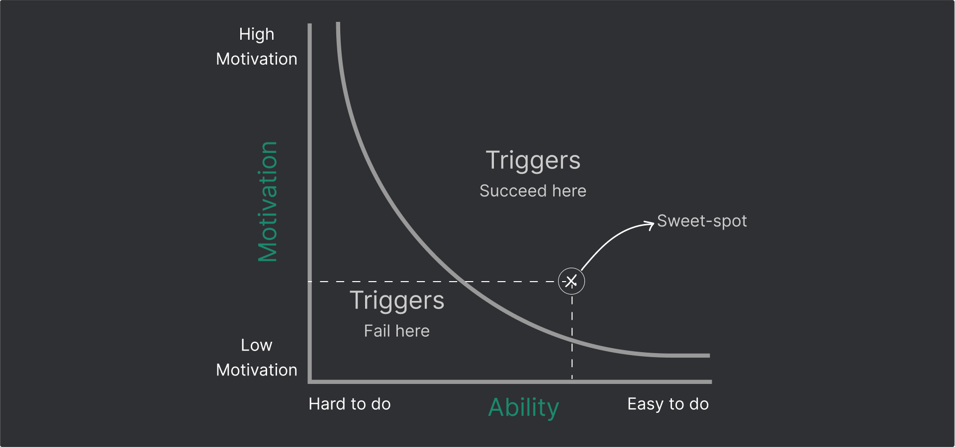
Based on a quick effort-impact assessment, we chose to explore user motivation and ability. The CEO and I believed that strong motivation could reduce the need for prompting, which narrowed our focus to two areas: reward and effort.
Maximizing rewards required a business-driven approach—figuring out what users value and how to offer it, and considering budget constraints. Any reward came with a cost, whether covered by the business, grocery stores, or sponsors. While the business explored reward options, I focused on reducing the effort required—key to improving the user's ability and willingness to act. To do that, we first needed to understand how the process currently worked.
Defining the problem
To reuse the bag, users first had to purchase it, learn about its features, and download the app. Our focus was on users who had already done this and paired the bag with the app. The challenge was encouraging continued reuse. Due to business constraints, rewards couldn’t be very high, so ease of use was critical. The questions became: Is it easy to reuse the bag? Are the rewards easy to redeem?
Reusing the bag
Reuse is the app’s primary function and is placed prominently on the home screen alongside user points. The process involves three main steps:
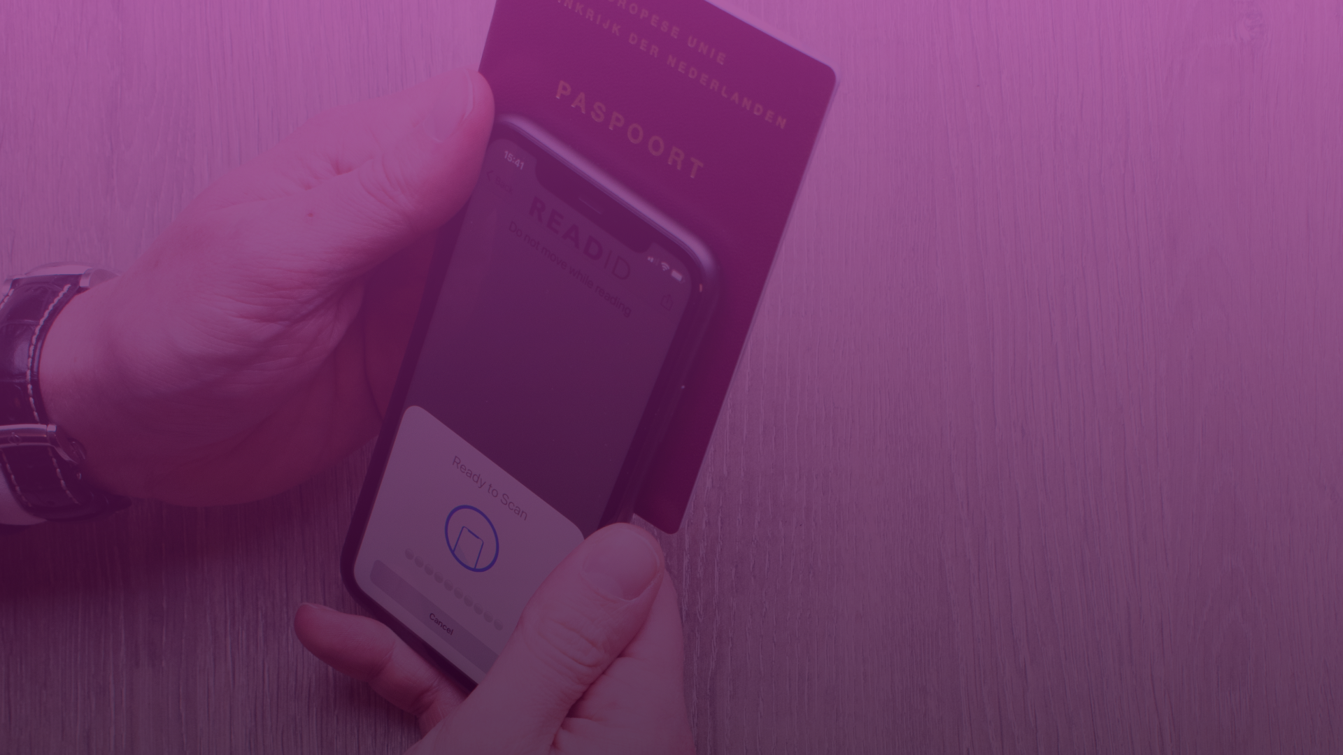
Click 1: Tapping the reuse button opens a sheet showing nearby stores. This ensures the user selects the correct location, especially when multiple stores are close together, as partner stores offer more points and extra benefits.
Click 2: Selecting a store confirms the choice and displays a prompt to begin scanning. This helps users verify the selected store and shows how to scan the bag tag.
Click 3: Triggers the phone's NFC reading feature to scan the bag’s chip and confirm reuse.
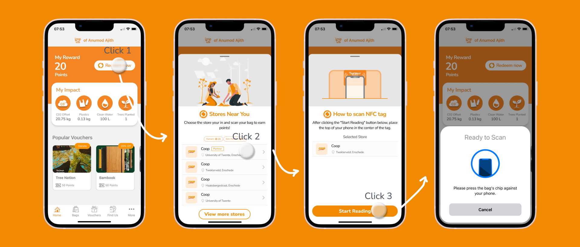
Scanning the NFC tag in-store was essential for tracking reuse. However, needing three taps each time felt excessive—especially for frequent users visiting stores multiple times a week—posing a risk to long-term engagement. The problem, then, was how to reduce the process from three taps to one, without compromising business needs.
Purchasing a reward
This process was simple. Users redeemed points for rewards they were already familiar with (e.g., discount vouchers), or in the case of donations, received immediate confirmation via email. There was no checkout process, making it quick and easy. Because this flow worked well, our main focus remained on improving the reuse flow.
Solving the problem
Achieving single click usage
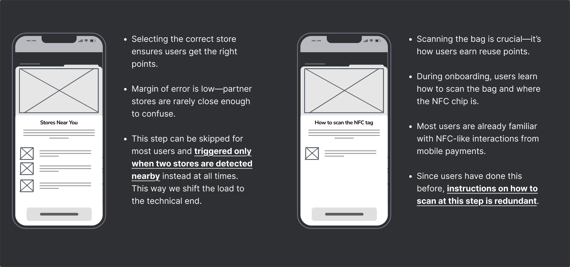
We identified two steps that could be safely skipped for returning users. By improving backend handling of edge cases, we enhanced the experience for both typical users and those in less common scenarios.
Store selection was in many cases unnecessary, as it was rare for two supported stores to be close enough for geolocation to become unreliable. Using progressive disclosure, we only showed this screen when the app couldn’t confidently determine the user’s location.
Instructions for scanning the NFC tag were redundant—users had already done this when pairing the bag, and the process is similar to familiar actions like contactless payments. Extra guidance remained available under the app’s "More" tab for those who needed it.
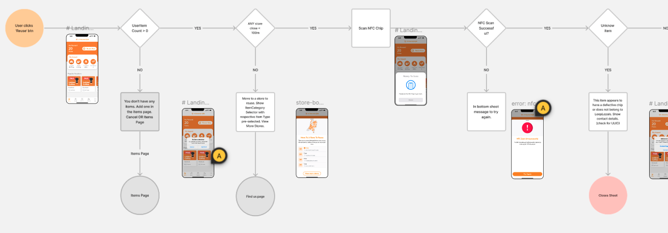
Handling edge cases & misuse
Our goal was to make reusing the bag as effortless as possible—ideally just a single tap. But achieving that meant carefully managing technical limitations and preventing misuse, without compromising the user experience.
What if the user isn’t inside a recognized store?
What if the app can’t determine their location?
What if the user hasn’t added a bag yet?
What if the user scans someone else’s bag or the wrong chip?
What if the user tries to reuse more than once a day (which isn't allowed)?
To tackle these situations, we created a comprehensive user flow diagram that mapped out every possible path—both happy flows and unhappy ones. Through iteration and refinement, we ensured that all cases were addressed clearly, guiding users through errors or edge cases without confusion.
Final result
The result: A single-click reuse experience for most users, backed by a robust system that gracefully handles everything else.
Reflection
I realized that reducing effort alone is only effective if the reward justifies using the bag. In hindsight, I wish we had also focused more on larger rewards as well and exploring other ways of rewarding users that also kept in mind the budget constraints.
We could have also explored further gamification of the app, such as leaderboards and streaks, similar to how Duolingo keeps users engaged. However, the challenge is that the reward of learning a new language is far more compelling than the motivation to reuse a bag for sustainability.
I would replace the dismissible bottom sheet with a simple notification banner, which would eliminate the need for users to dismiss it.

.png)


.png)