Overview
My roles
UI designer, UX design support, graphic designer, accessibility and QA tester.
About Inverid
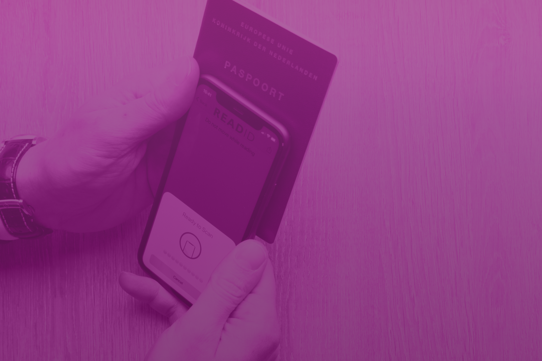
Inverid is an innovative company leveraging NFC technology within documents and modern phones to securely verify user identities. Inverid's SDK, utilized by major banks and governments, includes customizable screens and animations optimized for high conversion rates and effective management of error flows. Inverid also offers ReadID Ready, a no-code app for companies, and ReadID Me, a personal chip verification tool.
My role involved making several UI improvements, ensuring the design aligned with SDK limitations and other constraints. I collaborated closely with the UX specialist, contributing to brainstorming sessions and prototyping new features. I was responsible for analyzing quantitative data and conducting A/B tests to inform design decisions. Additionally, I brainstormed solutions with UX specialist for edge cases, conducted both internal and external testing of new features, animations, and instructions. I also created comprehensive documentation, presentation visuals, and was tasked with creating and maintaining the design system to ensure consistency across products.
Background
Context
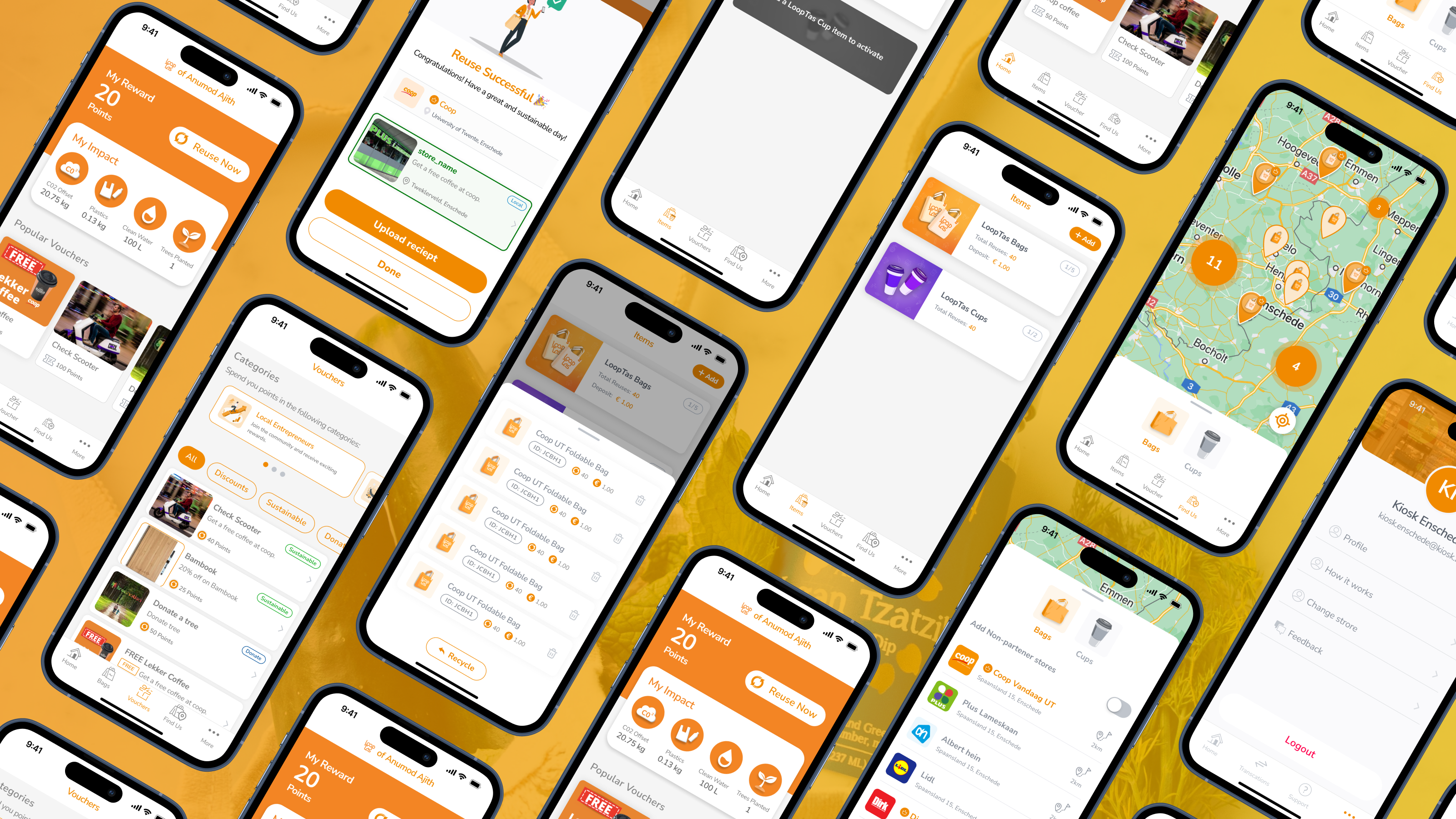
At Inverid, we have 2 main products, the ReadID UI SDK and the ReadID Ready app. This page focuses on the ReadID Ready app. This app uses our UI SDK to implement a turn-key application for clients who do not have their own app or their development team to implement the SDK. This helps them to quickly set-up their own white label app and access our features to help the safely and securely verify their users. The following is set up of the application.
.png)
The goal was to identify the points of improvements and improve the user experience of the Ready part. It was important to maintain simplicity to reduce code maintenance, be consistent with the UI SDK, allow and adapt for color set on run-time (after the QR code is scanned) and describe what colors are customizable for clients. Also consider that there is another way the user can enter this flow. Instead of using a QR code, user can directly come on the customer landing screen (the third screen from the left). Also keep accessibility in mind when considering improvements.
The process
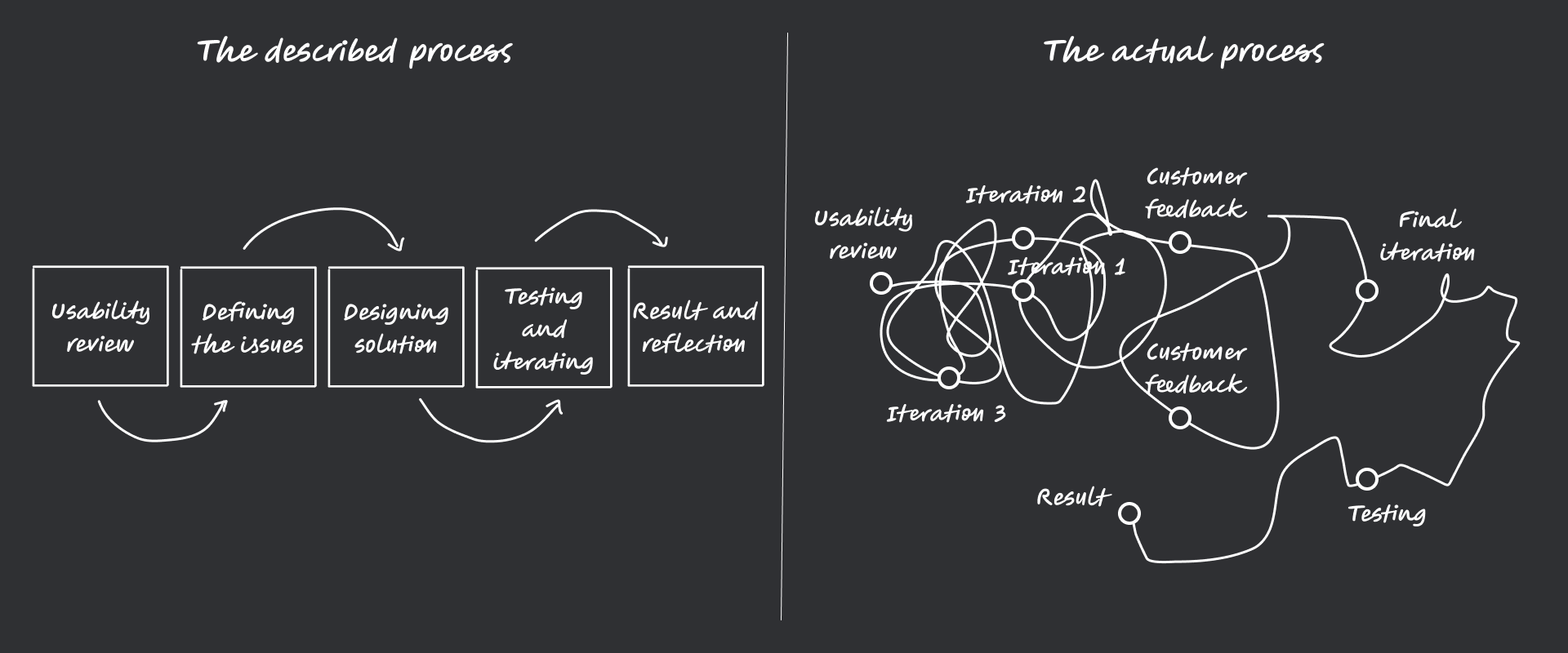
Bear in mind, we work in a agile scrum process, so not all the changes were done under the same project or epic though it was under the umbrella of improving UX and UI of the ReadID Ready app, the changes were not done in the order described. Scrum enabled us to make incremental changes to the app that slowly improved while were still able to devote our time to other equally important task such customer calls, documentation and the UI SDK project.
Identifying the problems
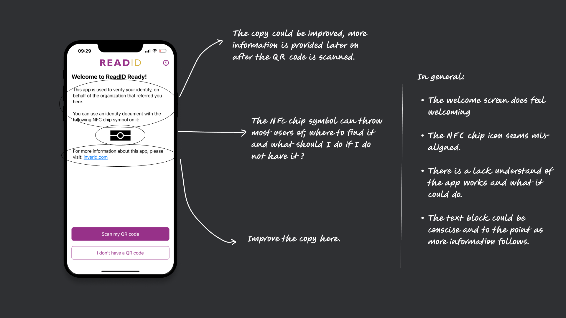
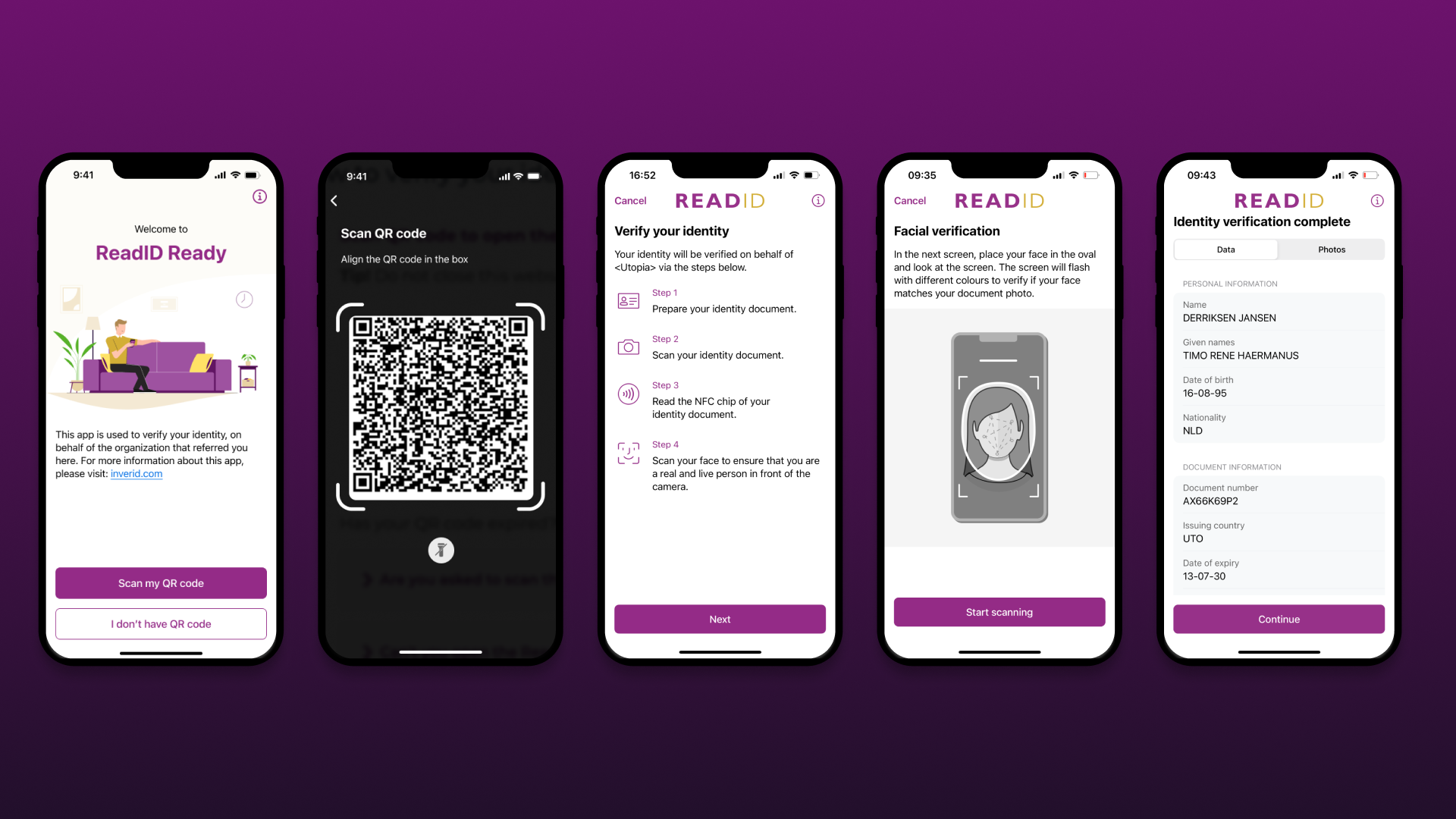
Welcome screen
The welcome screen lacks clarity and warmth. The copy should better explain the app’s purpose and why users should visit the site. The NFC chip icon is misaligned and may confuse users about its location and necessity. Overall, the text could be more concise, with key info upfront since more details follow later.4o
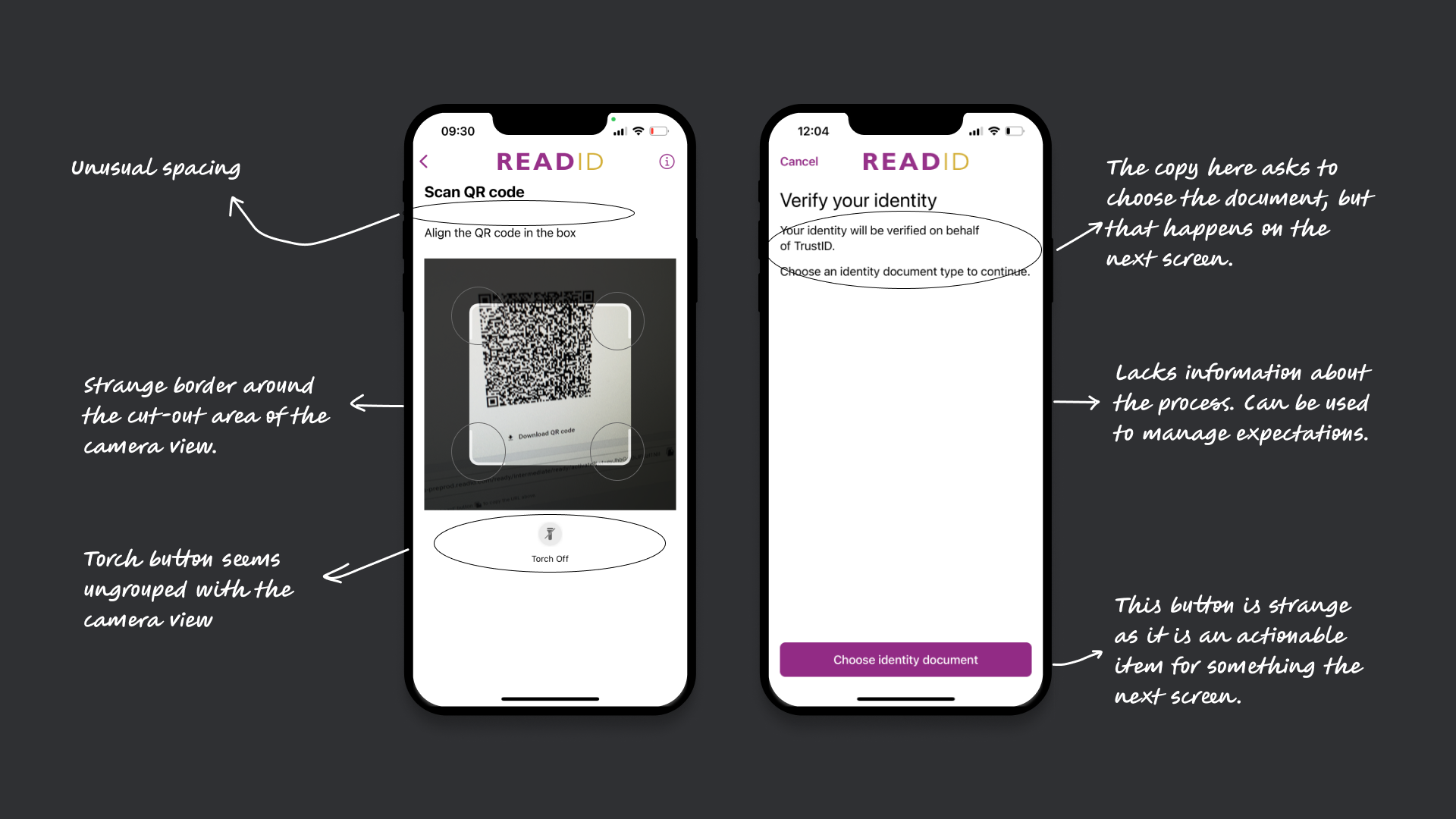
The Scan QR code screen and customer landing screen.
The scan QR code screen is meant to link users to the referring client via a QR code. However, there are UI issues: inconsistent spacing between title and text, a non-standard camera view with an odd border, and a torch button that feels disconnected from the camera interface.
The customer landing screen lets clients customize text and colors to match their brand and inform users who is verifying them. However, it has several issues: the copy asks users to choose a document—an action that happens on the next screen—creating confusion. It lacks context about the verification process and misses an opportunity to set user expectations. The button feels out of place, prompting an action that doesn't happen yet.
The facial verification instruction screen and result screen
The facial verification instruction screen uses animation to guide users to align their face in an oval before handing off to an external partner SDK. However, the step is intuitive enough that the animation feels unnecessary. Issues include inconsistent alignment of the title and body, outdated-feeling instructions, and too many moving elements—text changing alongside animation—making it hard for users to focus.
The result screen is meant to confirm successful document and identity verification by summarizing the extracted information. However, users often misinterpret it as a final confirmation—even when facial verification is incomplete. This can cause confusion and lead to repeated attempts. Visually, the tabs use the primary color unnecessarily, drawing too much focus. The grey banner background feels outdated, and the two-column layout is problematic for mobile accessibility, especially with larger fonts.

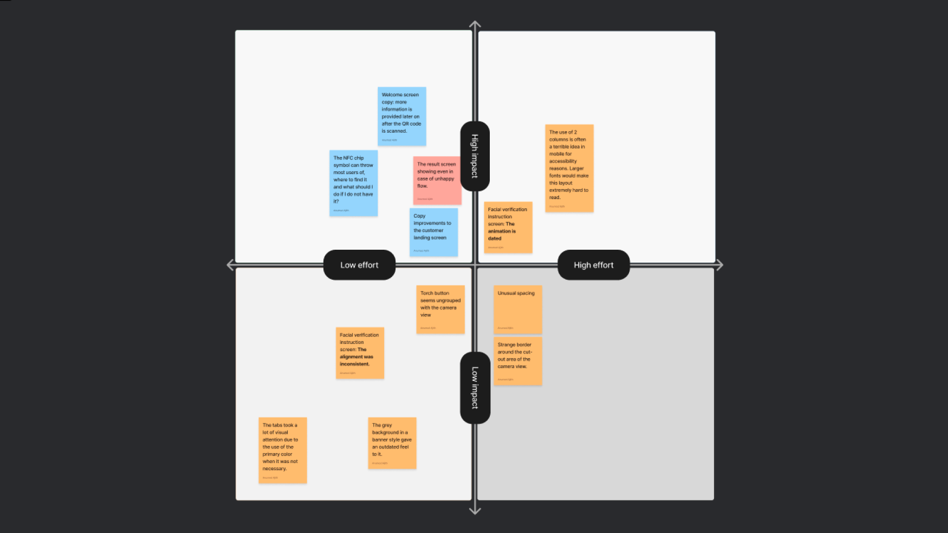
Prioritising and iterations
Using a simple effort-impact matrix, we were able to determine how to prioritize the tasks we wanted to do. We first arranged it ourselves as a design team and then re-arranged based on the feedback we recieved from the developers regarding the effort.
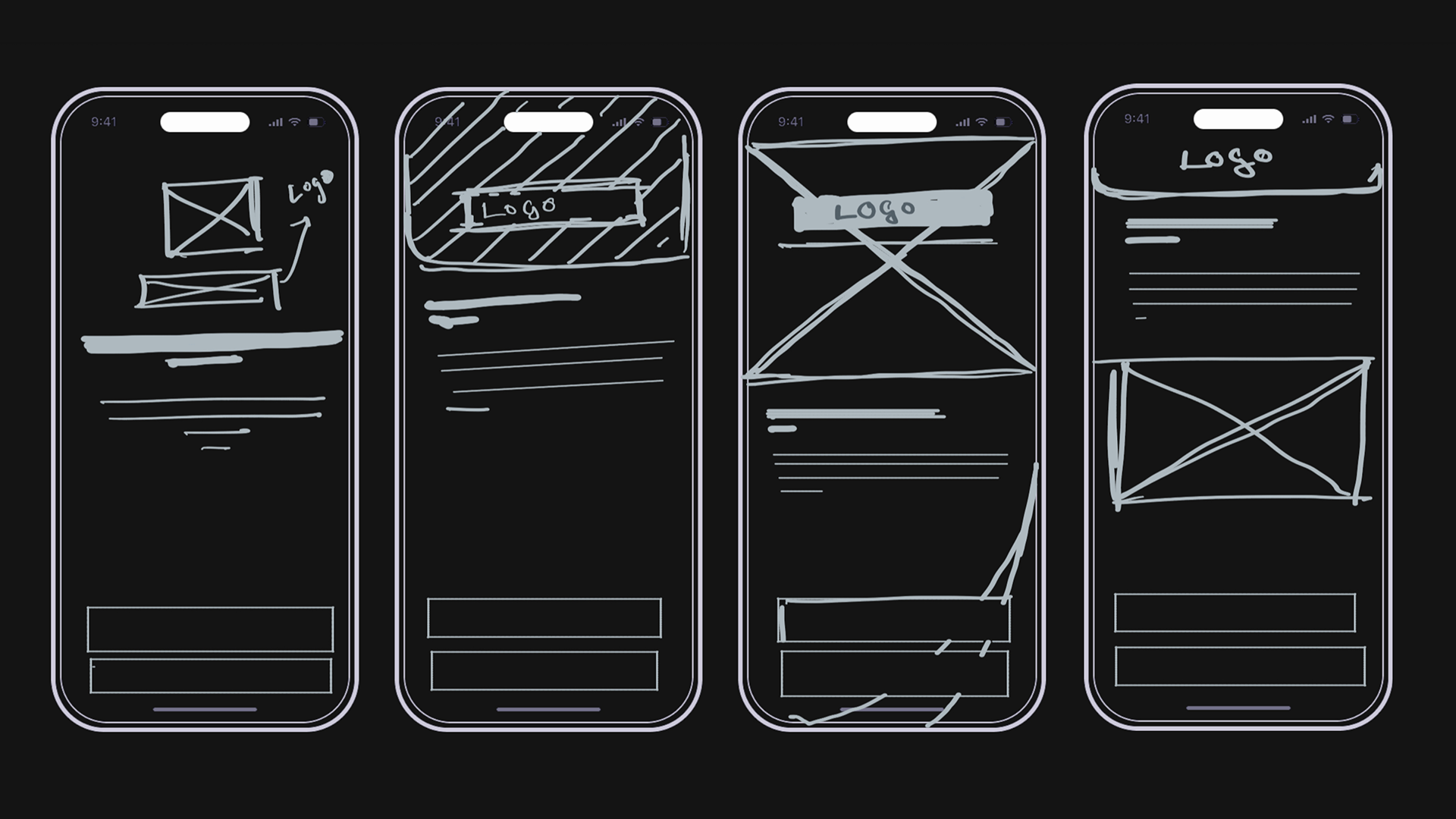
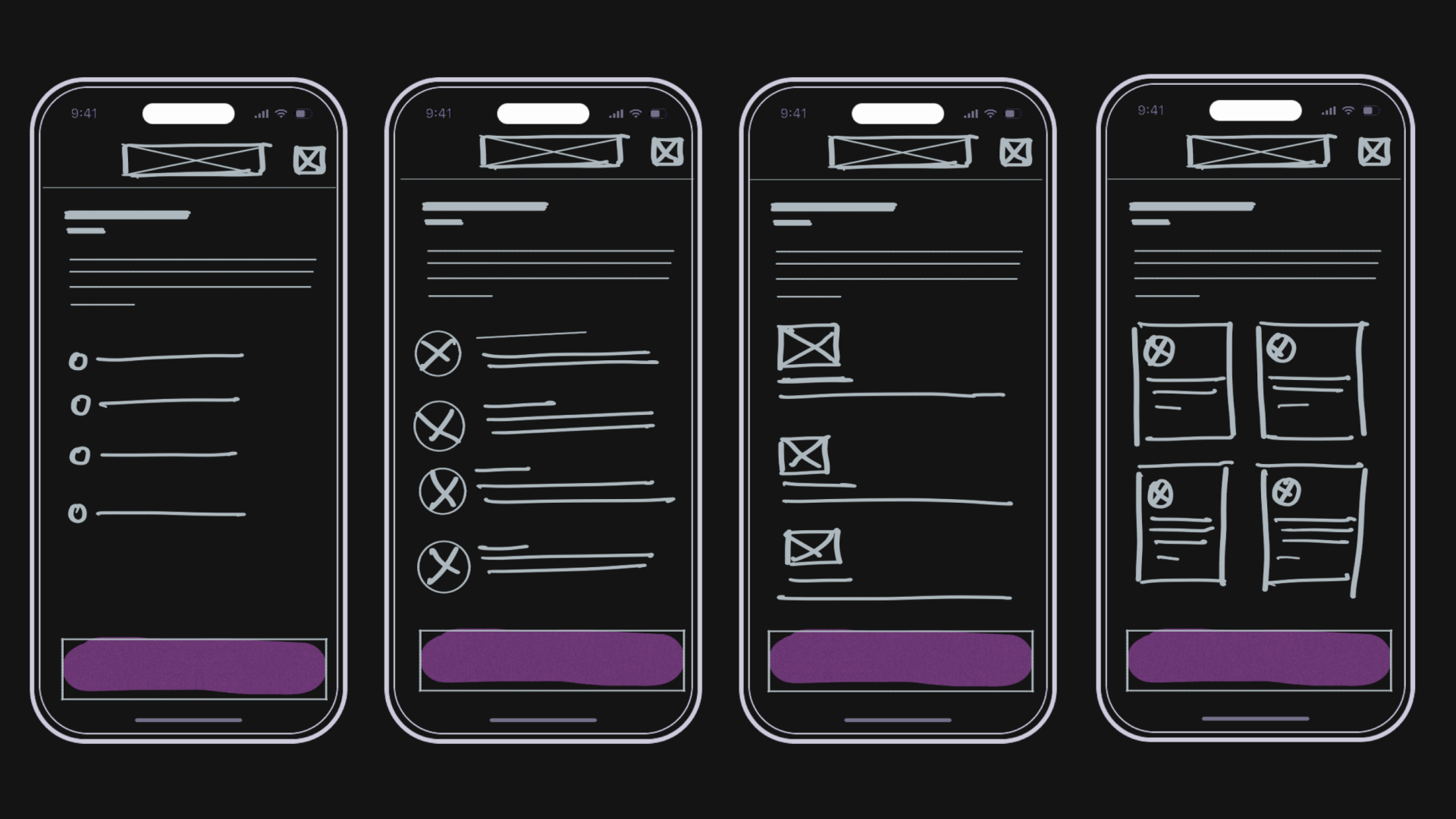
Wireframes and iteratiing
Quick sketches was used to iterate between different possible design and consider them in different contexts.
Welcome screen sketches:
Customer landing screen sketches:
Final Result
There’s a big leap between audit and outcome that’s hard to fully cover here. Working in a regulated space with a customizable, one-product-fits-all model introduces complexity—but we focused on delivering improvements without compromising flexibility. Other things that were considered while iterating and testing were: branded color implementation, copy customizations we offer, dark mode, landscape mode, larger font support, screen reader and responsiveness.
Changes made
Welcome Screen: Added a friendly illustration and trimmed the copy to focus only on essential info, creating a clearer visual identity for the entry point.
QR Code Scan Screen: Improved layout by using a more common large view, with better spacing and logical grouping.
Customer Landing Screen: Introduced step-by-step guidance to set clearer expectations for the verification process.
Facial Verification Instruction: Removed a complex animation in favor of a modern static illustration—simplifying the codebase without affecting conversion.
Result Screen: Now only shown after all verification steps are completed. Improved handling of unsuccessful flows. Switched to a system list component to improve accessibility (e.g. large fonts), and reduced visual noise by removing bold tab backgrounds.
Reflection
Here are a few things I wish we had done differently:
Track impact: While stakeholders were open to improving the experience, lack of clear business impact made prioritization difficult. Tracking outcomes would have helped secure ongoing attention for design improvements.
Surface client feedback early: Capturing and sharing useful client feedback could have built stakeholder confidence and highlighted the positive impact of our changes. It also offers a chance to reinforce best practices and revisit how clients implement Ready.
More end-to-end usability testing: We relied heavily on data and intuition, but broader testing—especially around the pre-download flow—was missing. Informing users why and how to verify is just as crucial as the in-app journey. App Clips help streamline this for iOS, but Android still requires a full download due to NFC limitations.
.png)


.png)